

































What a screen means depends on who’s looking at it
I helped a Metro Vancouver advertising network explain what it offers to advertisers, venue hosts, and media agencies.
My roleBranding, marketing strategy, and copywriting
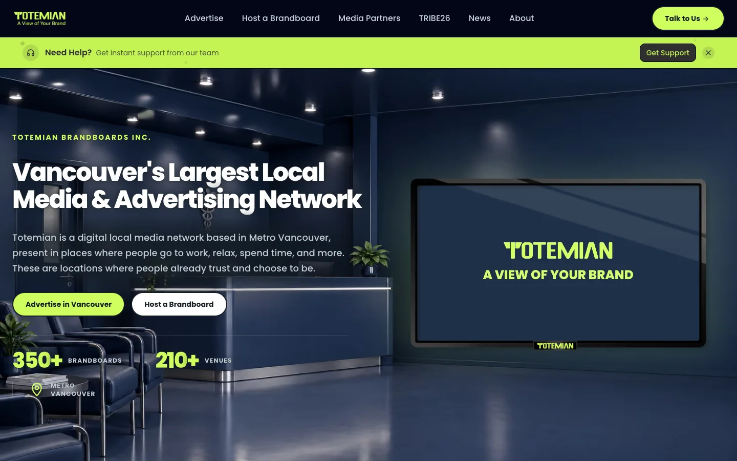
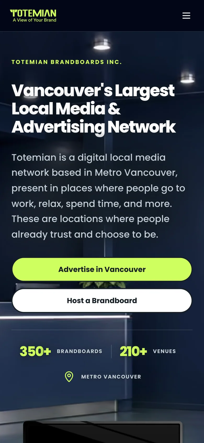
Totemian places digital screens in places people already visit, from cafés and salons to shops and clinics across Metro Vancouver. An advertiser wants to know who will see their campaign. A venue owner wants to know what will appear on the screen and how much control they’ll have. A media agency wants to understand where it can buy space and how it can report on a campaign. The same network has a different value to each of them.
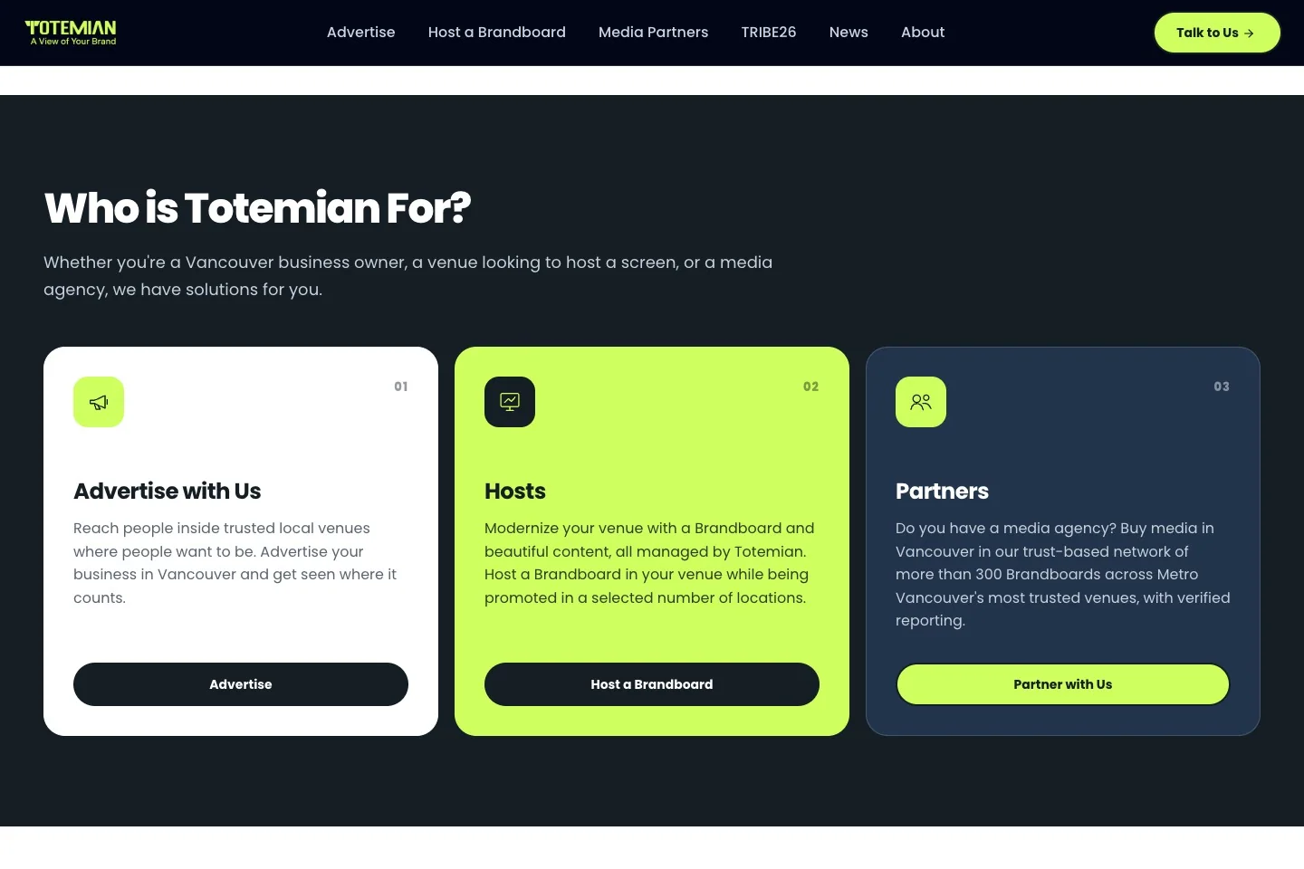
I helped give each audience its own route through the site. The advertiser page explains where campaigns can appear and what advertisers can buy. The host page explains what goes into the venue, who manages the content, and what the host can approve. Those differences determined what each page needed to say first.
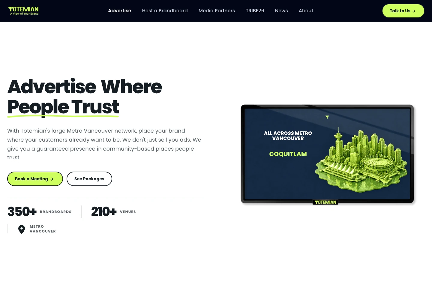
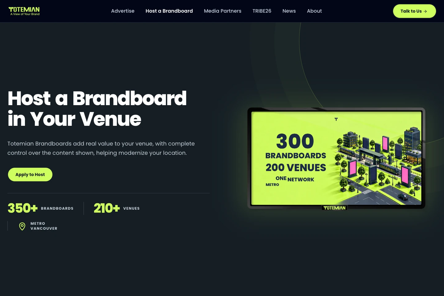
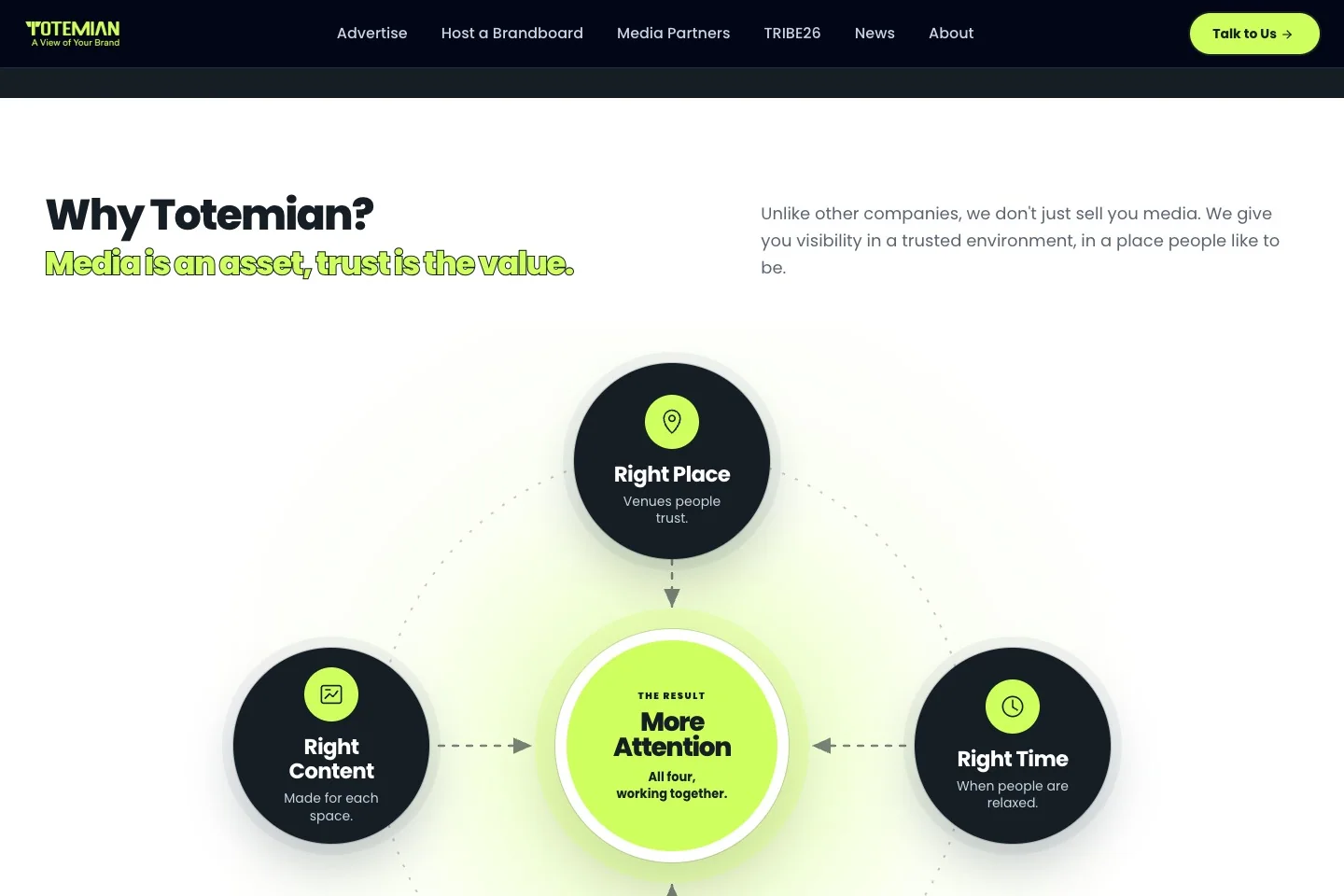
I also worked on how the brand shows up in news and social content. The website can take time to explain the network. A news graphic may have room for one photo and a headline. I worked with the navy and lime palette, photography, and a clear type hierarchy so the brand could carry both kinds of communication.
More projects
All work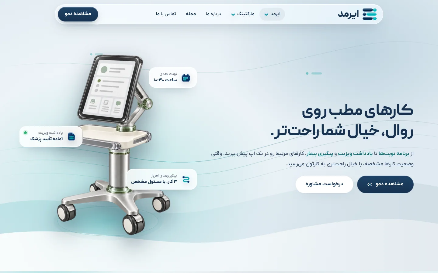
Eyrmed
I used familiar clinic workflows to explain Eyrmed’s software in Persian, from scheduling an appointment to following up after a visit.
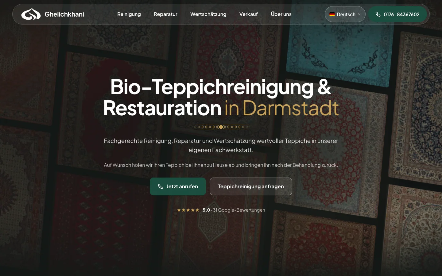
Teppichreinigung Ghelichkhani
I connected paid campaigns for a Darmstadt carpet care business with a site that shows what the workshop can clean and restore.
CrossNexa
I helped CrossNexa organize its German-language offer around what a business owner needs to do next, from getting found locally to exploring a new market.